Pager Modes
There are six pager modes in asp.net ajax grid view, depending on the mode, pager contains different controls to help users navigate the pages. Now, we will introduce you these pager modes: NextPrev Mode: the pager contains four buttons. First page, previous page, next page and last page pointing arrows. You can click the next page button to view the following page with datas, and click to the last page button to view the end of the the web grid. 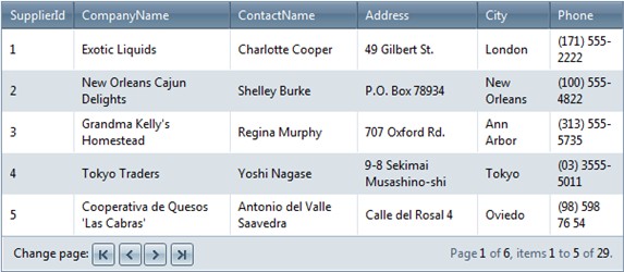 NumericPages Mode: the pager contains page numbers to navigate to each page. You can click the page index button to the wanted page view in the asp.net data grid. 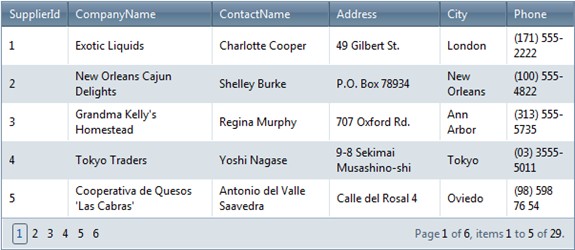 NextPrevAndNumeric Mode: the pager contains both arrow buttons and link buttons. It has the functions both NextPrev Mode and NumericPages Mode. You can find some more information at the right bottom of the grid view graphs. It shows the current page index in the total page count, and the id shown on current page to against the total rows items. 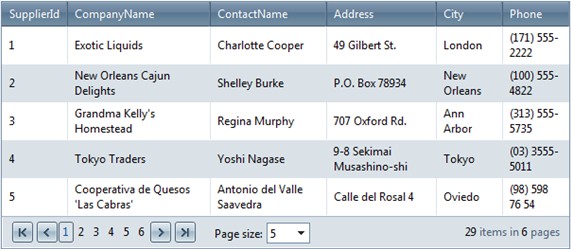 Advanced Mode: pager contains textbox. Users can input the wanted page number, and then input another Enter or click to "Go" button, this client side operation will be send back through javascript to the Kettic asp.net gridview control in the server side by ajax, the grid view graphs will redraw dynamically. 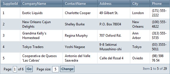 NextPrevNumericAndAdvanced Mode: pager contains all the controls in both "NextPrevAndNumeric" and "Advanced" modes. 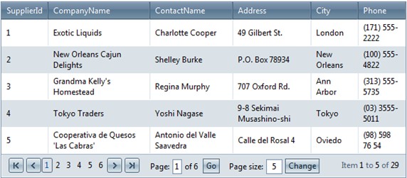 Slider Mode: pager contains a slider control to change pages. Just click the slider by your mouse, and drag the slider to the certain position, then the web grid will show this page data to you. 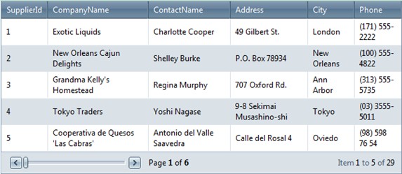 Pager Position
Grid provide the pager position in "Top", "Bottom" or "TopAndBottom", set the PagerStyle.Position property to the wanted value. Usually the web grid view pager items is located at the bottom, but for special purpose, we also provide the other two mode. C# example code
Pager Button styles
Pager button styles only for the four navigation buttons : "first page", "previous page", "next page" and "last page". Users can customize the button image and tooltip. Here we take first page button as an example. Set PagerStyle.FirstPageImageUrl to specify the image URL for first page button. And set PagerStyle.FirstPageToolTip to specify the tooltip that is displayed when mouse hover the first page button. The left three other navigate page button have the similar properties. | 
ASP.NET AJAX UI Controls ASP.NET AJAX Chart UI Control ASP.NET AJAX Grid UI Control OverviewGetting StartedGrid Columns ElementsTypesHeadersGrid Rows ItemsCommand ItemResizingReorderingSortingPaging Pager Item Do PagingScrolling Do ScrollingScroll ShowingVirtual ScrollingGrouping Do GroupingGroup ExpressionsGroup ElementFiltering Do FilteringFiltering ExpressionSelecting Selecting RowsExportingOperating Edit ModeEdit RecordsValidationData BindingGrid Style |