Information to Candle Chart
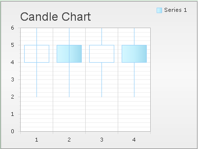
Candle chart combines the features of line and bar charts to display a set of value changes based on time or date. CandleStick chart, also call stock market chart, can be used into real time stock history analysis. The web stock chart can show live data of stock in seconds, minutes, hours, days even years historical price trend. There are three main elements within a Candle chart: filled bar, empty bar and line. The filled bar shows that the opening value is greater than closing value, while the empty bar indicates opposite meaning - the closing value is greater than the opening value, and the line in the bar center displays the extreme high and low values.
Here is the sample image for Candle chart:  How to Build a Simple CandleStick Chart
By using KT.UI ASP.NET Chart Components, end users can easily create and modify stock chart, ranging from option for selecting Candle chart type to advanced Candle chart settings, like chart skin, title, orientation as well as other appearance properties.
With the support of AJAX web programming technique, our UI ASP.NET Chart Control can allow users to create and view chart on web side with very short time and great convinence.
Here are the general beginning steps for creating a target chart with AJAX technique: drag an "AjaxPanel" control from Toolbox to "aspx" file, and then, drag a chart control from Toolbox into the built "AjaxPanel". Basic Settings
Following codes and descriptions are for selecting target stock chart type and setting Candle chart title, orientation and skin to adjust chart appearance. And we can finish setting these parameters within property window of chart creating project. Please check out demo codes below respectively.
Now we will show you how to define these candle chart basic settings using C#.
CandleStick Settings
This part tells how to add and set the series of data of Stock chart. We can set multiple series according to the particular data Candle's categories. And the number of each set of values can range from 1 to n. We add Candle chart data series by using "ChartSeries.Points" control of KT.UI ASP.NET Chart Control. If you insert two data series into the web candle stick chart, it means you add two stock history data to the chart, you can compare these two stock trend, and do good analyzing to make the best decision.
Here are the explanations of Y values in a Candle chart:
Usually, YValue and YValue2 change between YValue 3 and YValue 4. And we can get different control appearance if we interact the size of YValue and YValue2 or the scale of YValue3 and YValue4. Following C# sample code shows you how to set the YValues of candle chart in page load method.
Besides chart series, with the rich support of chart element component library, we are also capable of setting the Candle color via "ChartSeries.StyleSet.Fill.PrimaryColor" control. If we want to change more properties of given Candle, we can use Candle appearance property item to adjust the Candle dimensions, height, width, and margins. With the different color, you can understand each trend line's performance more clearly. Detailed chart series setting guides can be fund here: chart series element setting guides. More Tutorials
See more information on building CandleStick chart within C# ASP.NET application. | 
ASP.NET AJAX UI Controls ASP.NET AJAX Chart UI Control OverviewGetting StartedChart Element DiagramSeriesAxesLegendCaptionTickData GridChart Type Bar ChartPoint ChartLine ChartPie ChartArea ChartGantt ChartBubble ChartBezier ChartSpline ChartSpline Area ChartCandle Chart Chart With StackedFull Stacked ChartFeatures Automatic LayoutAutomatic Text-wrappingScrollingEmpty ValuesScale BreakMultiline LabelsWise LabelsMarking AreasMultiple TypesInteractiveDrill DownShadowEdtingData Binding Array DataList DataDatabase DataXML DataChart Style Chart SkinASP.NET AJAX Grid UI Control |