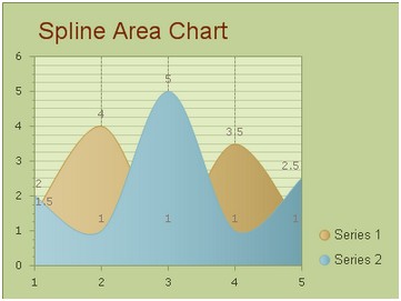
Information to Spline Area Chart
Using spline area chart, we can not only display several data series in one chart but also approximate the intervening values the data series have owned. In the real practical application, when creating a spline area chart, you just need to set multiple series of data values and then the KaxChart will do the rest for you automatically. You can make a spline area chart in our free online demo for spline area chart.
To help you have a better visual impression of the spline area chart graph, here we attach a screen shot of the general look of a spline area chart.  And you can make stacked spline area chart just like stacked bar chart, it's really very simple, just need you choose the web chart type, and the left will be done by our asp.net ajax chart control. How to Build a Simple Spline Area Chart
Now in this section, we will show you how to make a spline area chart into your ASP.NET web application using our ASP.NET AJAX SDK.
First, please drag and drop an AjaxPanel item from the toolbox to your aspx web page and then drag a chart control from the toolbox to that Ajaxpanel. Then you need to configure the settings from following two aspects. Basic Settings
The basic settings for building a spline area chart using ASP.NET AJAX SDK mainly contain four parts, which are setting the chart type, customizing the chart title, setting the chart orientation and designing the chart skin. And all these settings can be done within the property window. Now we will offer you the detailed guidance for above settings.
As developers can set these properties in aspx by changing code, customizing in C# code is also a good way.
Area Settings
Now comes the part of area settings which are responsible for the displaying data series. For the area settings, there are two points that need to be noted here. One is that the number of data series in the area chart is various, ranging from 1 to N. The other is that each data category may have different items. Thus, you can use the property ChartSeries. Items to add item to each data group. If you want to insert multiple series data into your spline area chart, you may find that the first series data will appear at the front of the spline area chart graphics in the diagram, the other display at the bottom level may be covered some parts.
Sometimes, when there are multiple data series in the area chart, to increase the chart's visibility, we may display each data series with different colors. Then the spline area chart may have a better surface, so that users can indentify each data categories more clearly and easily. And this effect can be easily achieved by using the property ChartSeries.StyleSet.Fill.PrimaryColor. Now, look at the below C# sample, you can get the details of changing color style of chart series.
More settings of Series to see Chart Series Element.
If you want to build a spline area chart using Visual C# .NET programming code, you can read build spline area chart using c#. | 
ASP.NET AJAX UI Controls ASP.NET AJAX Chart UI Control OverviewGetting StartedChart Element DiagramSeriesAxesLegendCaptionTickData GridChart Type Bar ChartPoint ChartLine ChartPie ChartArea ChartGantt ChartBubble ChartBezier ChartSpline ChartSpline Area Chart Candle Chart Chart With StackedFull Stacked ChartFeatures Automatic LayoutAutomatic Text-wrappingScrollingEmpty ValuesScale BreakMultiline LabelsWise LabelsMarking AreasMultiple TypesInteractiveDrill DownShadowEdtingData Binding Array DataList DataDatabase DataXML DataChart Style Chart SkinASP.NET AJAX Grid UI Control |