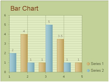
Information to Bar Chart
Bar chart, which uses either horizontal or vertical bars to compare the values among different data series, is widely used for demonstrating the value comparisons among multiple data series. Comparing to the simple bar graph, you may be more interested in stacked bar chart, which can show percentage number of bar data. Following picture is a screenshot of a bar chart example which compares the values or amounts of two data categories.  How to Build a Simple Bar Chart
In this part, we will show you how to create a simple bar chart with two data series and insert the bar chart into an aspx page. You can view bar chart online demo on this page. Before following the setting tutorial below, please make sure that you have created a web form application in visual studio and embedded all necessary dlls into this ASP.NET web application. Another thing that needs to be noted here is that, to achieve the AJAX effect, you need to drag an AjaxPanel item from the toolbox to the target aspx page and put a chart control into that AjaxPanel.
After you finish above operations, please follow the guidance below to configure some settings. Basic Settings
Users can finish these basic settings for creating a bar chart within the property window. And here we offer detailed guidance for users to set the chart type, chart title, chart orientation and chart background color in ASP.NET application.
You can follow the C# sample code to set the basic chart settings.
Bar Settings
This section will show you how to add multiple data series into above created bar chart and how to customize the number of items and their values within each data series. Before render the asp.net chart control, you can decide how many bar groups to add, define the order of bar group and bar item. What's more, if you want to combine multiple types of chart together or flex two charts, such as adding line chart to bar chart, you just only need to change one group data of chart series to Line type.
In the following sample aspx code, we will try to add dual data series values into bar chart. Here each data category has five items. And you can freely add more items to the data series using the property ChartSeries.Items. Each data item can insert the description as tooltip, so it make you chart demo more interactive to users. And with useful legned describing each group data detailed, the web chart will more clearly.
Of course, to better display the comparisons between different data series, you can choose to demonstrate each data category with different bar colors by using ChartSeries.StyleSet.Fill.PrimaryColor. And you can also define the axis of chart using C# code.
More settings of Series to see Chart Series Element. Related Bar Chart Creating Guidance | 
ASP.NET AJAX UI Controls ASP.NET AJAX Chart UI Control OverviewGetting StartedChart Element DiagramSeriesAxesLegendCaptionTickData GridChart Type Bar Chart Point ChartLine ChartPie ChartArea ChartGantt ChartBubble ChartBezier ChartSpline ChartSpline Area ChartCandle Chart Chart With StackedFull Stacked ChartFeatures Automatic LayoutAutomatic Text-wrappingScrollingEmpty ValuesScale BreakMultiline LabelsWise LabelsMarking AreasMultiple TypesInteractiveDrill DownShadowEdtingData Binding Array DataList DataDatabase DataXML DataChart Style Chart SkinASP.NET AJAX Grid UI Control |