Information to Spline Chart
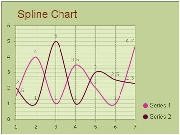
Unlike line chart that connect data points with straight lines, this spline chart graphics connect the data points with curved lines. And spline chart are often used in project which requires the use of curving fittings, like impulse-response charts.
The KaxChart control allows users to build a fully customized splint chart in aspx web page. And this tutorial will guide you to finish this spline chart task. You can make a spline chart in our free online demo for spline chart.
Following image is a screenshot of a spline chart.  How to Build a Simple Spline Chart
In this part, we will show you how to create a simple spline chart with two data series and insert the spline chart into an aspx page. Before following the setting guidance below, please make sure that you have created a web form application in visual studio and embedded all necessary dlls into this ASP.NET web application. Another thing that needs to be noted here is that, to achieve the AJAX effect, you need to drag an AjaxPanel item from the toolbox to the target aspx page and put a chart control into that AjaxPanel.
After you finish above operations, please follow the guidance below to configure some settings in aspx file. Basic Settings
Users can finish these basic settings for creating a spline chart within the property window. And here we offer detailed guidance for users to set the chart type, chart title, chart orientation and chart background color in ASP.NET application.
Here we will introduce you how to set the above properties using C# demo code.
Spline Settings
This section will show you how to add multiple data series into above created spline chart and how to customize the number of items and their values within multiple data series.
In the following sample programming code, we will try to add two different data series into spline chart in aspx web page. Here each data category has seven items. And you can freely add more items to the data series using the property ChartSeries. Items.
Of course, to better display the comparisons between different data series, you can choose to demonstrate each data category with different spline colors by using ChartSeries.StyleSet.Fill.PrimaryColor. What's more, specify the chart axis is also supported, you can see the following C# code for details.
More settings of Series to see Chart Series Element. Related Spline Chart Creating Guidance | 
ASP.NET AJAX UI Controls ASP.NET AJAX Chart UI Control OverviewGetting StartedChart Element DiagramSeriesAxesLegendCaptionTickData GridChart Type Bar ChartPoint ChartLine ChartPie ChartArea ChartGantt ChartBubble ChartBezier ChartSpline Chart Spline Area ChartCandle Chart Chart With StackedFull Stacked ChartFeatures Automatic LayoutAutomatic Text-wrappingScrollingEmpty ValuesScale BreakMultiline LabelsWise LabelsMarking AreasMultiple TypesInteractiveDrill DownShadowEdtingData Binding Array DataList DataDatabase DataXML DataChart Style Chart SkinASP.NET AJAX Grid UI Control |