Overview of Kettic Chart UI for ASP.NET AJAX
Kettic UI for ASP.NET AJAX documentation is designed to offer the most popular and client side chart controls to developers and end users. With our easy to use Chart UI for ASP.NET AJAX components, users can easily integrate chart components to ASP.NET and C#.NET applications to create and built more than ten kinds of chart types to display target data series.
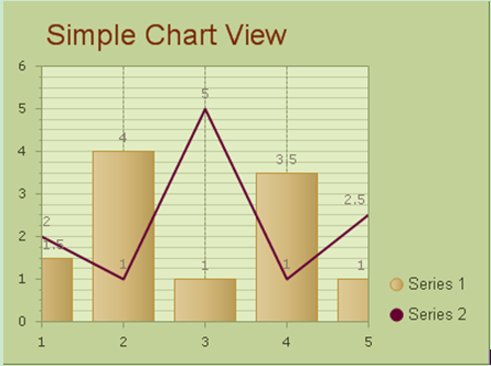
Chart sample image created by using KT.UI Chart Component in ASP.NET AJAX.  Chart Types Overview
In this part, you can get the basic introductions to each chart type.
- Bar Chart: Bar chart is well known as the most commonly seen and used chart type. The bars in bar graph can be horizontally and vertically displayed. With bar chart, we can easily compare multiple data series among different categories. See how to build bar chart and bar chart demo image here.
- Point Chart: Point chart is also known as scatter chart, which is widely used in scientific data modeling to display the relationships between two or among multiple series of values. Point chart also can be in horizontal and vertical forms. Check here to see how to build point chart within ASP.NET.
- Line Chart: Line chart, also can be called line graph, is the basic type of chart and displays series of data points to show specific trends and changes over a period of time. See how to build line chart using ASP.NET control.
- Pie Chart: Pie chart is commonly used to display fractional sector/slice to a whole. A pie chart can contains multiple data series and display each series values in separate pie part. See ASP.NET pie chart drawing component.
- Area Chart: Area chart is developed based on the line chart to display series of data points. The data points are linked by a line and the areas below the data line is filled. Area chart also can show specific trends. Go to see use ASP.NET codes to create area chart.
- Gantt Chart: Gantt chart, also called Time chart, is used to display different events over a period of time, with a beginning and an end. Check guides on drawing Gantt chart.
- Bubble Chart: Bubble chart is the advanced version of point chart, which shows data points in the form of circle or any other shape with defined size. It is widely used in scientific data and financial data fields. See tutorials on ASP.NET Bubble Chart cretion.
- Bezier Chart: Bezier Chart shows data series on a curved line and is used for data modeling by interpolating data point. Check here to see how to create Bezier Chart within ASP.NET project.
- Spline Chart: Spline Chart still displays data points by a curved line and interpolates the limited data point to process data modeling. Link to ASP.NET Spline Chart drawing.
- Spline Area Chart: Spline Area Chart displays multiple data points with corresponding filled areas. Go to get guides on creating Spline Area Chart.
- CandleStick Chart: CandleStick chart consists bar and line elements and used mostly in price or currency fluctuations fields, especially stock prices. The bar and lines in CandleStick chart displays the value variation over time. Check ASP.NET CandleStick chart creation to get more detailed chart introduction.
- Chart With Stacked: Chart With Stacked is used to displays the different series of values to whole. The stacked graph can be both horizontal and vertical form. Check link to ASP.NET AJAX UI for Chart With Stacked.
- 100% Chart With Stacked: 100% Chart With Stacked is an extension of Chart With Stacked, which regards the whole as 100% and the data values for trends as percentages. Detailed information of 100% Chart With Stacked within ASP.NET.
| 
