Information to Gantt Chart
Gantt chart, also can be called Time charts, is usually used for displaying time based separate data values, which contains a beginning and an end. When we need to show a time planning data series, we can plot these data on a gantt chart. For most purpose, the gantt chart is used to make a business plan, and the chart graph view as a schedule. The time span of the schedule is depending on your needs, it may be years, months, days, even hours and minutes.
And like most of other chart type, we can create and view gantt chart in two forms: vertical and horizontal. We can set the chart series orientation property to vertical to create a vertical gantt chart and set the chart series orientation attribute to horizontal to draw a horizontal gantt chart. Please try to make a gantt chart in our free online demo for gantt chart.
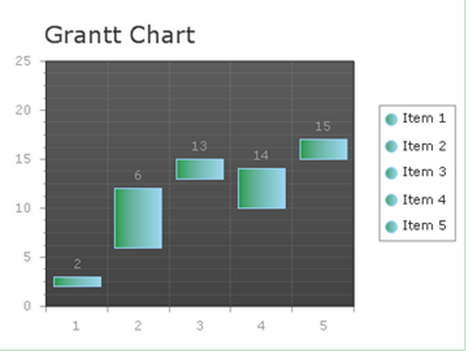
Following is a sample image of gantt chart created by KT.UI ASP.NET AJAX Chart Control:  How to Build a Simple Gantt Chart
Like we promised, KT.UI for ASP.NET provides not only the advanced and comprehensive chart components, but also the complete developing online guides. Please read this part carefully to be well informed of drawing a simple gantt chart.
First, we need to drag an "AjaxPanel" control to "aspx" file to realize effect of AJAX technique and before we implement following specific operating steps, we need to drag a chart control from "Toolbox" into "AjaxPanel". Basic Settings
At the very beginning, we are supposed to learn how to choose the required chart type - gantt chart. After this, we can use chart title, chart orientation and chart skin components to customize gantt chart appearance, and all of which are listed in chart property window.
Besides specifid these properties in aspx design mode, you can also change the basic settings using C# code in aspx.cs.
Gantt Settings
Now, let's come to the most important part of gantt chart - that is how to set data series. Technically speaking, we can display multiple sets of data series within a gantt chart, and the particular data points contained in a series of data are user-defined. If there is only one data series in web gantt chart, the chart graphics will dispaly single timeline in the diagram. If there are multiple data series in the ajax gantt chart, it means the schedule manages two or more planning at the same time. And legend is important to multiple series data in gantt chart, it can separete each time planning more clearly.
Following sample tutorial shows how to add data series, if you have more values need to be shown on gantt chart, you can refer to "ChartSeries. Items" to have a modification.
YValue and YValue2 are the start and end potion of data item in a chart. YValue shows the begin time of one plan in the project schedule, and YVlaue2 shows the stop time of one plan in timeline. Each YValue can show the difference timeline in the chart view. And of course, we can use the method of "ChartSeries.StyleSet.Fill-PrimaryColor" to change the gantt chart color. If you are interested, check out more settings of series: Chart Series Element. For the last, we want to show you how to customize the chart axis in C# .net.
See Also
If you still need the manual on creating gantt chart using C# programming language, go to: build gantt chart using C#. | 
ASP.NET AJAX UI Controls ASP.NET AJAX Chart UI Control OverviewGetting StartedChart Element DiagramSeriesAxesLegendCaptionTickData GridChart Type Bar ChartPoint ChartLine ChartPie ChartArea ChartGantt Chart Bubble ChartBezier ChartSpline ChartSpline Area ChartCandle Chart Chart With StackedFull Stacked ChartFeatures Automatic LayoutAutomatic Text-wrappingScrollingEmpty ValuesScale BreakMultiline LabelsWise LabelsMarking AreasMultiple TypesInteractiveDrill DownShadowEdtingData Binding Array DataList DataDatabase DataXML DataChart Style Chart SkinASP.NET AJAX Grid UI Control |