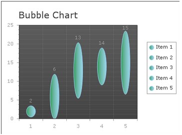
Information to Bubble Chart
Similar to point chart, bubble chart is also able to show correlations among multiple data series. But different from point chart, each point in the bubble chart may be displayed in various shapes, like circle or oval. Besides, the bubble chart owns the ability to compare the relationship among data objects in 3 numeric-data dimensions, which are the X-axis data, the X-axis value and the data presented by the bubble size. Therefore the bubble chart is often used in scientific data modeling or financial data analysis.
And in this online tutorial, we will put the focus on how to create a simple bubble chart in ASP.NET web application.  How to Build a Simple Bubble Chart
Before following the instructions below, please make sure that you have installed .NET Framework 3.5 or later versions, that you have created a web form in the visual studio and that you have assembled all the necessary ASP.NET AJAX dlls into your ASP.NET project. Besides, to achieve the AJAX effect, you also need to drag an AjaxPanel item into the aspx page and put a chart control from the toolbox into that AjaxPanel.
After you finish above preparing works, you may use the sample codes below for creating a bubble chart in your ASP.NET application. Basic Settings
Users can finish these basic settings for creating a bubble chart within the property window. And here we offer detailed guidance for users to set the chart type, chart title, chart orientation and chart background color in ASP.NET application.
Here we provide some C# example for changing the basic bubble chart settings.
Bubble Settings
This section will show you how to add multiple data series into above created bubble chart and how to customize the number of items and their values within each data series. Besides, you can define the legend label to descript each data item.
In the following sample code, we will try to add two different data series into bubble chart. Here each data category has five items. And you can freely add more items to the data series using the property ChartSeries.Points.
Note: the YValue in following asp.net code represents the start point of each data item and the YValue2 stands for the end point of that data item.
Be different from other chart type, bubble chart data series have some special setting, please see the C# Code below.
Of course, to better display the comparisons between different data series, you can choose to demonstrate each data category with different bar colors by using ChartSeries.StyleSet.Fill.PrimaryColor.
More settings of Series to see Chart Series Element. And you can view Bubble chart online demo on this page. Related Bubble Chart Creating Links | 
ASP.NET AJAX UI Controls ASP.NET AJAX Chart UI Control OverviewGetting StartedChart Element DiagramSeriesAxesLegendCaptionTickData GridChart Type Bar ChartPoint ChartLine ChartPie ChartArea ChartGantt ChartBubble Chart Bezier ChartSpline ChartSpline Area ChartCandle Chart Chart With StackedFull Stacked ChartFeatures Automatic LayoutAutomatic Text-wrappingScrollingEmpty ValuesScale BreakMultiline LabelsWise LabelsMarking AreasMultiple TypesInteractiveDrill DownShadowEdtingData Binding Array DataList DataDatabase DataXML DataChart Style Chart SkinASP.NET AJAX Grid UI Control |