Introduction to Pie Chart
Acting of as one of the most important chart types, Pie charts are widely used when we want to show the contribution and relationship of separate fractional parts to the whole. With pie charts, we can get the clear result of numerical proportion of multiple series of data. Within a Pie chart, the size of each slice area is logically proportion to the quantity of it presents. The most commonly used with pie chart illustrator may be as the budget graph view.
Not like the other chart type in the asp.net ajax, a pie chart can only include single group series of data, and each item in data series is displayed in a separate slice. Please note, the legend in pie chart show the each data item information but not each group data name, which is different from other chart type like bar chart or scatter chart. By using KT.UI for ASP.NET AJAX, uses are able to precisely and quickly create and customize pie chart, such as easily finishing pie settings and tailoring the properties of pie sectors with the help of pie chart appearance customizing controls. You can make a pie chart in our online demo for pie chart.
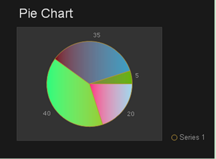
Please see online demo image of pie chart::  How to Build a Simple Pie Chart
As mentioned before, KT.UI for ASP.NET AJAX is a completely client side component library, users can independently draw and define pie chart within a little time. In order to better guide users, here we also give the tutorials of building a basic pie chart in details. You can generate pie chart in 2D style, and pie chart with 3D effects in html is also supported. What's more, we made a asp.net online demo for interactive pie chart with animation in ajax.
So as to realize the Ajax technique, we need to drag an "AjaxPanel" control to "aspx" window from Toolbox at first, and then drag a chart control from Toolbox into "AjaxPanel"; finally we are required to implement following two tutorials: basic settings and pie settings. Basic Settings
What is the basic operation of a chart creation is to choose a target chart type, here we choose "Pie". Then, we can define the appearance of chart within the chart property window, including chart title, skin and others. Besides, users can define the tooltip property in the pie chart, while the mouse move on the pie slice, there would be a description show up as a label. Please check the sample codes below:
To set pie chart basic properties, developers can change the setting in property panel while indesign mode, or change code in aspx, or resetting the properties using C# code.
Pie Settings
After finishing the basic elements creations, we can deal with the most important part of pie chart - that is data series. Technically speaking, a pie chart can consist of multiple series of data, which can be user-defined. And we can add the series data by calling the method of "ChartSeries.Items". And each pie chart slice can display the percentages which the number is comparative with the total data, Kettic asp.net chart control will calculate the percentage automatically in back processing. Please see following demo ASPX codes.
In addition, pie chart is different from other chart types in the capability of customizing pie color. We know, a pie chart is made of several sectors that stand for different series of data. Each data item will received a slice with centern degree, which the angles is depending on the data capacity. With the "ChartSeriesPoint.StyleSet.Fill.PrimaryColor" control, we can set the color of each pie chart slice to better distinguish numeric data.
More settings of chart series can be found in Chart Series Element. Different from other chart type, in pie chart, you can set each part of chart to wanted colors. The color can be the system color, or the html web used color. Now we will show you how to do it using C# code.
Also See
If you are developers using C#, please go to build pie chart using c#. | 
ASP.NET AJAX UI Controls ASP.NET AJAX Chart UI Control OverviewGetting StartedChart Element DiagramSeriesAxesLegendCaptionTickData GridChart Type Bar ChartPoint ChartLine ChartPie Chart Area ChartGantt ChartBubble ChartBezier ChartSpline ChartSpline Area ChartCandle Chart Chart With StackedFull Stacked ChartFeatures Automatic LayoutAutomatic Text-wrappingScrollingEmpty ValuesScale BreakMultiline LabelsWise LabelsMarking AreasMultiple TypesInteractiveDrill DownShadowEdtingData Binding Array DataList DataDatabase DataXML DataChart Style Chart SkinASP.NET AJAX Grid UI Control |