The Kettic Data Grid Control has the ability to display the summary rows while applying the grouping feature, or show total rows which have result values calculated from the functions like Sum, Count, Min, Max, Average, etc. What's more, these results can be completely customized as necessary. The key properties are listed below. Developers can define each property in design time aspx property windows, or write the C# code in runtime.
Data Items
Each grid view has a set of rows which represent a list of data. The number of the rows depends on the number of rows in the Data Source. Kettic asp.net ajax Gridview control allow users to delete row, add row, insert row and edit row data in the gridview. There are two types of Data items:
 Users can set the ItemStyle of the Nromal Rows and the AlternatingItemStyle of Alternating Rows to change the appearance of the rows. In default, Alternating Rows are enable to make a clear discrimination of two types of rows, and you can set EnableAlternatingItems to False to disable it. You can view alternating row online demo for details. Pager Item
The pager is a row located at the bottom of the gridview control. There are some paging navigation controls in the pager, such as page up, page down, page count and so on. Developers can set the AllowPaging property to change the visible of the pager. And Kettic asp.net gridview provide rich pager style, such as NextPrev Mode, NumericPages Mode, Advanced Mode, Slider Mode and so on. please see another free online demo for grid view pager mode in asp.net.
 StatusBar Item
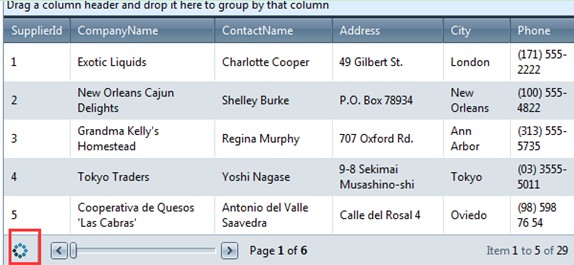
The StatusBarItem is a row at the end of the grid. It usually used to show the information of asynchronous AJAX requests. If the clicked the nexe page, and the data is loading, then the status bar item will display a animated gif to tell you the loading is not completed.
 | 
ASP.NET AJAX UI Controls ASP.NET AJAX Chart UI Control ASP.NET AJAX Grid UI Control OverviewGetting StartedGrid Columns ElementsTypesHeadersGrid Rows Items Command ItemResizingReorderingSortingPaging Pager ItemDo PagingScrolling Do ScrollingScroll ShowingVirtual ScrollingGrouping Do GroupingGroup ExpressionsGroup ElementFiltering Do FilteringFiltering ExpressionSelecting Selecting RowsExportingOperating Edit ModeEdit RecordsValidationData BindingGrid Style |