The appearance of Grid directly determines its feel and look. To help users customize the appearance of grid in the most direct and flexible way, the grid control provided several ways to specify the its layout and performance. Grid Skins and CSS
As we know, the skin of the grid view, which has two main elements, image and Cascading Style Sheets (CSS), is directly responsible for how the grid look and what feel it brings to the viewers. Grid component contains a number of pre-defined skin styles and users can easily use these existing embedded skins by defining the value of the Skin property to the name of target skin style. Of course, you are also allowed to use your own customized skin. Before offering you the detailed guidance of customizing the grid skin, we need to mention one point that you need to define an empty value to the Skin Property and set the EnableEmbeddedSkins property to False. Now we will show you how to use your own skin to grid view. Just following the steps below:
Row Appearance
In grid view, there are two types of rows: Normal Item and Alternating Item. Normal Item: the odd rows of the grid. Set ItemStyle property to customize normal rows appearance and performance. Alternating Item: the even rows of the grid. Set AlternatingItemStyle property to customize alternating rows appearance and performance. Look at the example below: ASPX code:
C# code:
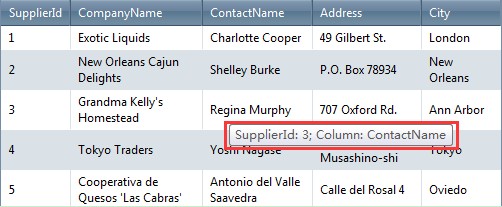
Grid Item Tooltips
When you hover the grid item with mouse, maybe you want to show the tooltips to make clear the meaning of current item. And there are two types of tooltip for the grid items. One is for GridHeaderItem, the other is for GridDataItem. Here we will introduce you how to add tooltips in the ItemCreateEvent. C# code:
 | 
ASP.NET AJAX UI Controls ASP.NET AJAX Chart UI Control ASP.NET AJAX Grid UI Control OverviewGetting StartedGrid Columns ElementsTypesHeadersGrid Rows ItemsCommand ItemResizingReorderingSortingPaging Pager ItemDo PagingScrolling Do ScrollingScroll ShowingVirtual ScrollingGrouping Do GroupingGroup ExpressionsGroup ElementFiltering Do FilteringFiltering ExpressionSelecting Selecting RowsExportingOperating Edit ModeEdit RecordsValidationData BindingGrid Style |