Datetimepicker is the combined control of datepicker and timepicker that belong to the whole kettic ASP.NET Ajax Calendar UI SDK. From sample image below, we can see we are able to set and customize date and time freely with support of Datetimepicker component within ASP.NET application.
Web calendar Datetimepicker includes three components: DateInput, calendar and timeview. When we click DatePopupButton button, we can see calendar popup window and choose certain date, and when we click the button of TimePopupButton, the timeview will popup and allows us to choose and set time.  DatePopupButton Within ASP.NET Project
DatePopupButton is the first button in the sample image, by clicking this control we are capable of set following properties: Visible, ImageUrl, Border, ToolTip, BackColor, etc. TimePopupButton Within ASP.NET Project
The second button is TimePopupButton, with the support of which we are able to set properties, like Visible, ImageUrl, Border, ToolTip, BackColor and others. DateTimePicker Properties Within ASP.NET Project
TimeView Within ASP.NET Project
DateInput Within ASP.NET Project
ASPX Sample codes for setting above demonstrated properties of datetimepicker. And more demo codes can be found in how to set html calendar datetimepikcer in C#.
Sample screenshot of date time picker created within ASP.NET application. 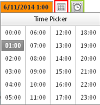 | 
ASP.NET AJAX UI Controls ASP.NET AJAX Chart UI Control ASP.NET AJAX Grid UI Control ASP.NET AJAX Barcode UI Control ASP.NET AJAX Button UI Control ASP.NET AJAX Calendar UI Control OverviewGetting StartedCalendar element TitleNavigation ControlsColumn and Row HeadersPickers TimePickerDatePickerDateTimePicker MonthYearPickerUsing shared Calendar/TimeViewFormatting ValuesTemplates Calendar Day TemplatesCalendar Header and Footer TemlatesFeatures Customizing the Day MatrixMulti-View ModeManaging DatesDate SelectionClient Prpgramming Calendar EventServer Programming Calendar EventPicker EventASP.NET AJAX NavigationBar UI Control ASP.NET AJAX Captcha UI Control ASP.NET AJAX Color Editor UI Control ASP.NET AJAX ComboBox UI Control ASP.NET AJAX DataPager UI Control ASP.NET AJAX Dock UI Control ASP.NET AJAX DropDownList UI Control ASP.NET AJAX DropDownTree UI Control ASP.NET AJAX HtmlEditor UI Control ASP.NET AJAX FileManager UI Control ASP.NET AJAX Filter UI Control ASP.NET AJAX Input UI Control ASP.NET AJAX ListBox UI Control ASP.NET AJAX ListView UI Control ASP.NET AJAX ToolBar UI Control ASP.NET AJAX TabControl UI Control ASP.NET AJAX Menu UI Control ASP.NET AJAX ToolTip UI Control |