Kettic Calendar for ASP.NET Library is dedicated to offering users rich and easy to use calendar features customizing controls, including tool for setting calendar day matrix, option to define calendar multi-view mode, support for setting calendar managing dates and control for date selection. We just discuss how to set and customize calendar feature day matrix by using ASPX APIs and codes in this tutorial page.
By default, Calendar sets up its day matrix like an ordinary calendar, containing 7 columns (one for each day of the week) and 6 rows (the maximum number of weeks needed in a month). However, users can easily and quickly change this default layout only using two properties with the support of Calendar features components: Orientation and MonthLayout.
On Calendar, the arrangement of items is mainly decided by Orientation and MonthLayout properties and has three types: 7x6, 14x3, and 21x2. We will discuss each month layout with users one by one in following texts. Please read each of them respectively to set your own calendar viewing mode. Month Layout=7x6
When Orientation is "RenderInRows" (the default), the days are laid out horizontally, in rows. While Orientation is "RenderInColumns", the days are laid out vertically, in columns. This part is designed for showing a single month layout using both horizontal and vertical orientation:
When we set MonthLayout = "Layout_7columns_x_6rows" and Orientation = "RenderInRows", each row in calendar represents a single weak. See following sample image. 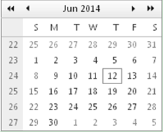
When we set MonthLayout = "Layout_7rows_x_6columns" and Orientation = "RenderInColumns", each column in calendar stands for a single weak. Following is the sample image. 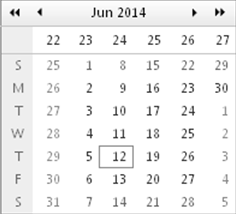 Month Layout=14x3
When we set Orientation is "RenderInRows" (the default), the days are laid out horizontally, in rows. Following is the demo image of the settings: MonthLayout = "Layout_14columns_x_3rows" and Orientation = "RenderInRows". 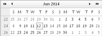
When we choose and define the Orientation is "RenderInColumns", the days are laid out vertically, in columns. Check out example screenshot below of MonthLayout = "Layout_14rows_x_3columns" and Orientation = "RenderInColumns". 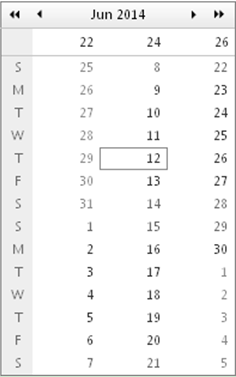 Month Layout=21x2
 runs like above two month layout modes, also have two options: Orientation is "RenderInRows" and Orientation is "RenderInColumns".
Following is the simple screenshot of month layout in "RenderInRows" mode. MonthLayout = "Layout_21columns_x_2rows" and Orientation = "RenderInRows". 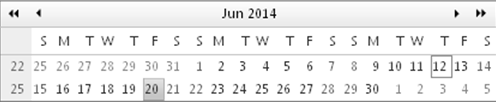
See also the demo image for settings: MonthLayout = "Layout_21rows_x_2columns" and Orientation = "RenderInColumns". 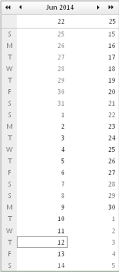 Changing Matrix Dimensions Directly
Demonstrated below is the demo image for month layout settings: SingleViewRows=10 and SingleViewColumns=10. 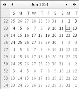 | 
ASP.NET AJAX UI Controls ASP.NET AJAX Chart UI Control ASP.NET AJAX Grid UI Control ASP.NET AJAX Barcode UI Control ASP.NET AJAX Button UI Control ASP.NET AJAX Calendar UI Control OverviewGetting StartedCalendar element TitleNavigation ControlsColumn and Row HeadersPickers TimePickerDatePickerDateTimePickerMonthYearPickerUsing shared Calendar/TimeViewFormatting ValuesTemplates Calendar Day TemplatesCalendar Header and Footer TemlatesFeatures Customizing the Day Matrix Multi-View ModeManaging DatesDate SelectionClient Prpgramming Calendar EventServer Programming Calendar EventPicker EventASP.NET AJAX NavigationBar UI Control ASP.NET AJAX Captcha UI Control ASP.NET AJAX Color Editor UI Control ASP.NET AJAX ComboBox UI Control ASP.NET AJAX DataPager UI Control ASP.NET AJAX Dock UI Control ASP.NET AJAX DropDownList UI Control ASP.NET AJAX DropDownTree UI Control ASP.NET AJAX HtmlEditor UI Control ASP.NET AJAX FileManager UI Control ASP.NET AJAX Filter UI Control ASP.NET AJAX Input UI Control ASP.NET AJAX ListBox UI Control ASP.NET AJAX ListView UI Control ASP.NET AJAX ToolBar UI Control ASP.NET AJAX TabControl UI Control ASP.NET AJAX Menu UI Control ASP.NET AJAX ToolTip UI Control |